Aquamore. Sports and wellness centres
Discover more about this project
Year
2024
Client
Aquamore
Tag
integrazione social, Progettazione sito web, Web design
Technologies
CSS3, Google Analytics, HTML 5, logo, mysql, PHP, PHP / HTML5 / Bootstrap, Wordpress
Visit the website
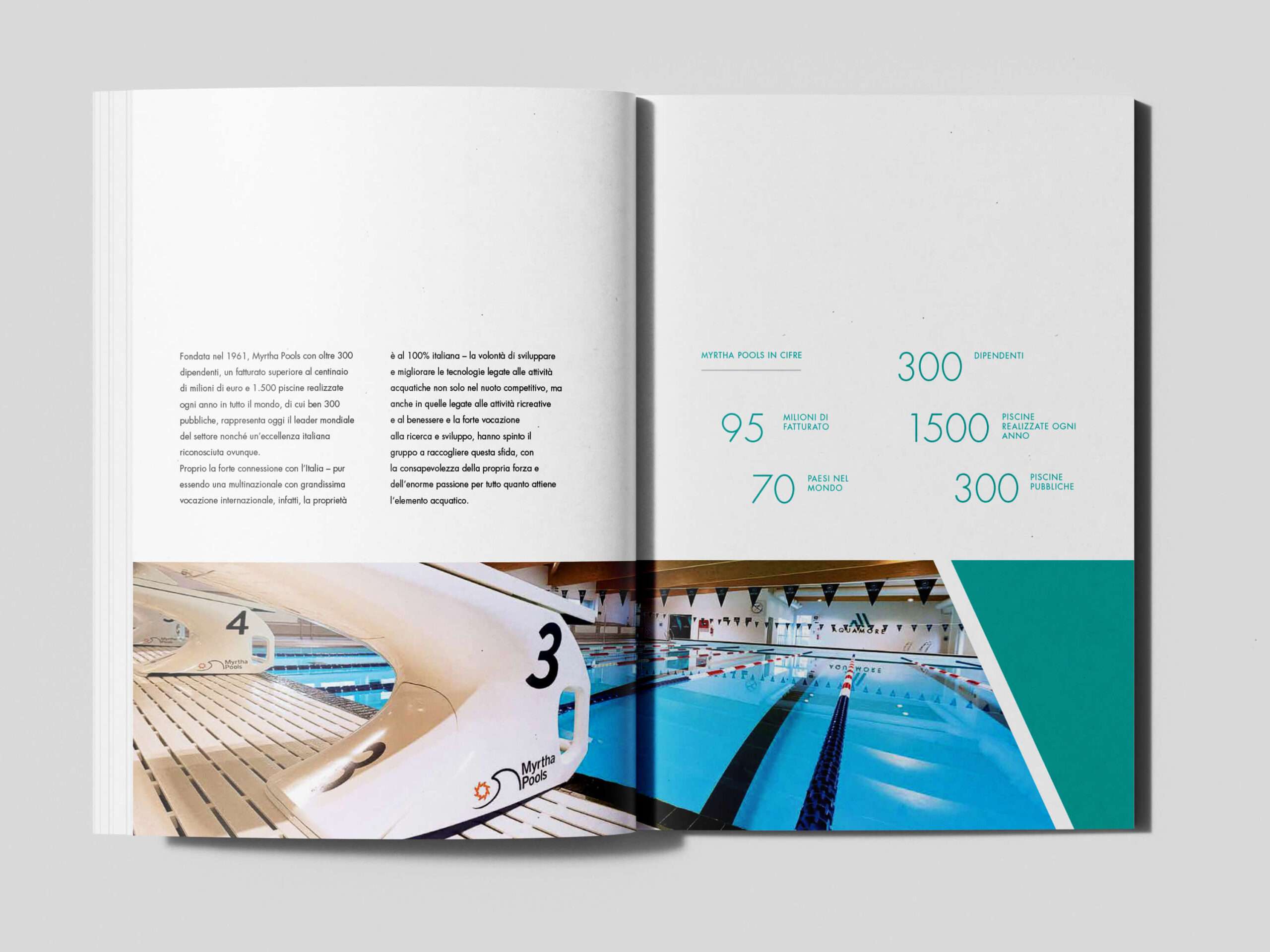
The Aquamore project was born with the objective of creating meeting places that can offer a fully satisfying experience for the body and mind, in modern and safe, inclusive and quality environments, where wellness, fun and movement can be combined.
We worked on the naming of the project, the design of the company logo and the creation of a coordinated and modern image that would represent the excellence of the brand in its target market.
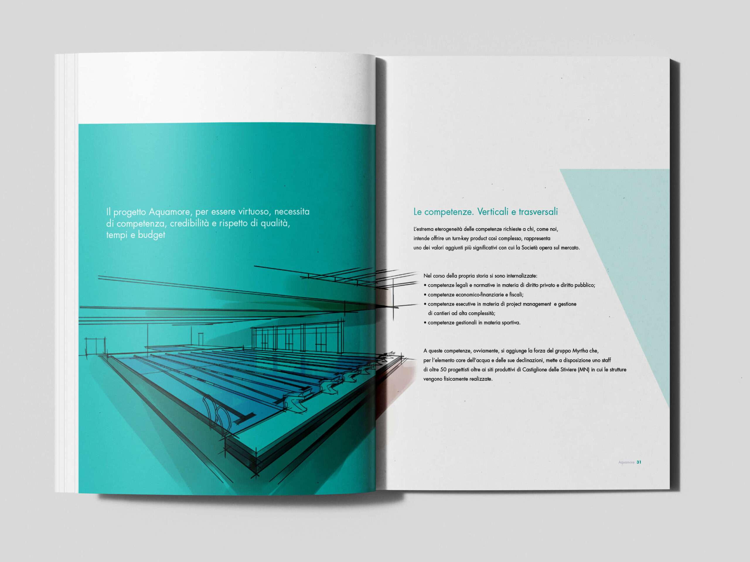
Building and carefully curating a brand identity is a crucial step to gain the trust of your audience, emerge with authority and differentiate yourself in the market.
Whether you are starting a new business or already have an established company, defining a strong brand identity is essential to ensure effective communication across all channels and to support a success-oriented strategy.
As a branding agency, Purelab offers specialised services in the creation and restyling of brand identity, working alongside companies and professionals.
With our expertise in brand identity design, we help you find the right fit in the market and create an authentic connection with your customers, turning them into true fans of your brand. We enhance your strengths and make your company instantly recognisable!
Logo and visual identity.
The logo is the official brand identity of the Aquamore brand. The symbol consists of a series of diagonally inclined shapes that recall the letters A for Aqua and M for More, in two different shades that suggest their three-dimensionality, despite the flat design. This symbol, in association with the Aquamore logotype, constitutes the main logo to be used as the first choice.
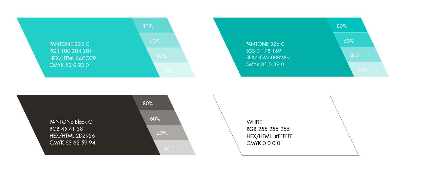
Colour Palette
The primary palette establishes the main colours of the Aquamore corporate identity. For cases where the use of PANTONE® colours is not possible, the closest equivalent should be used as shown in this section.
The main font family is Futura®.
First presented by the Bauer Type Foundry in 1928, Futura is a sans serif typeface designed by German typographer and graphic designer Paul Renner.
It was presented by Renner himself at the 5th Milan Triennale in 1933 and was a great success in a very short time.
The Futura® font is highly recommended for graphic design and design work, in particular for all paper and print materials.
The secondary font family is Muli®.
Available as a Google Font, Muli is a sans serif font designed primarily for use as a display font. Muli can be used when the Futura font is not available and is recommended for digital and web-based work, as it is easily implemented.
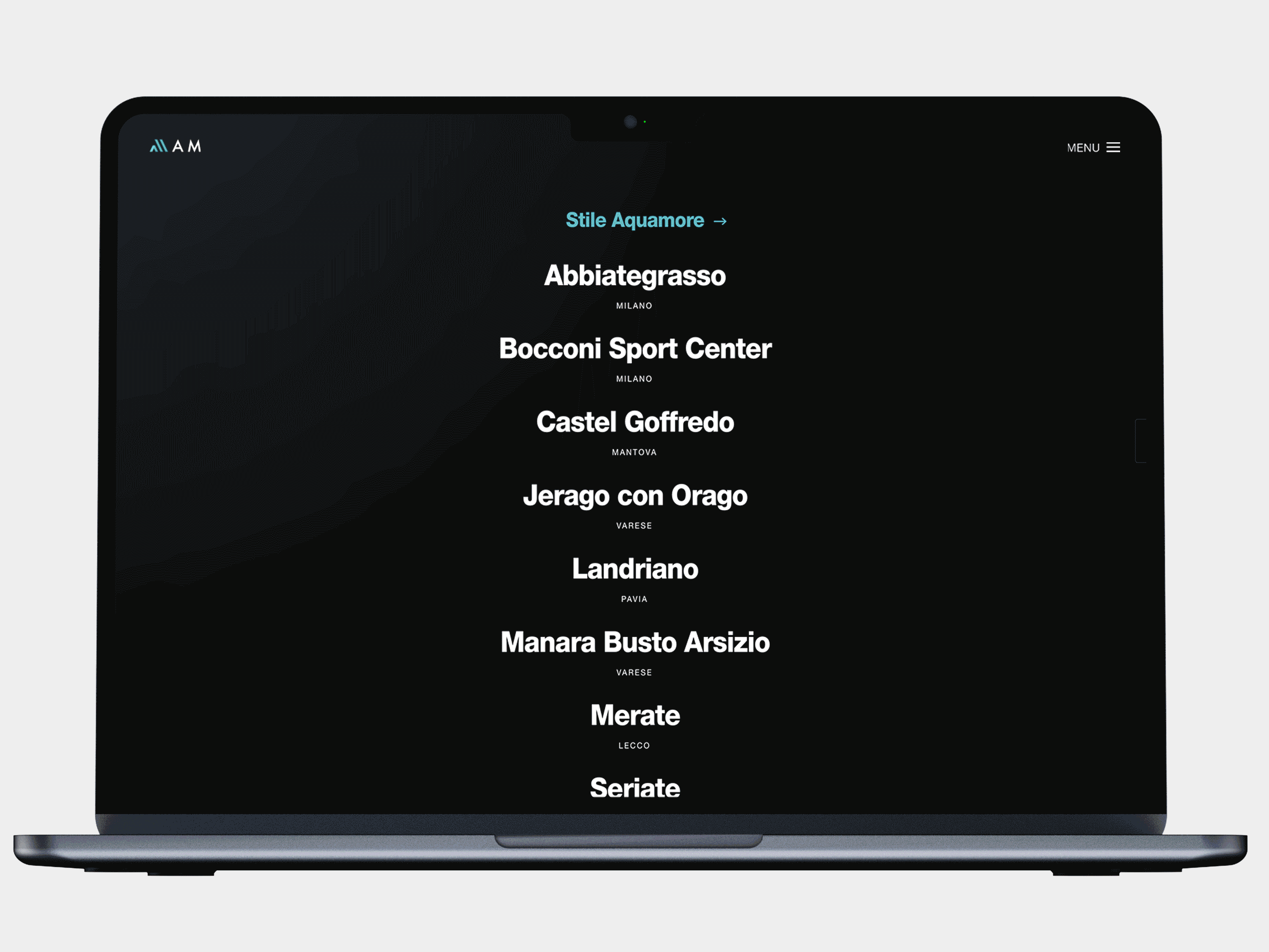
Website and digital presence.
The aquamore.it platform has been a key element in the promotion and presentation of the new brand, and has become the main digital landing point for users of all sports facilities.
Careful attention was paid to the design to ensure a simple and smooth user experience on mobile and desktop devices.
An intuitive navigation and well-organised information architecture was developed to meet the needs of visitors.
The CMS used was WordPress in multistep configuration. This content management system, one of the most widely used in the world, is open source, highly flexible and versatile. Its ease of use allowed it to be easily adopted by the staff located in the various sites.
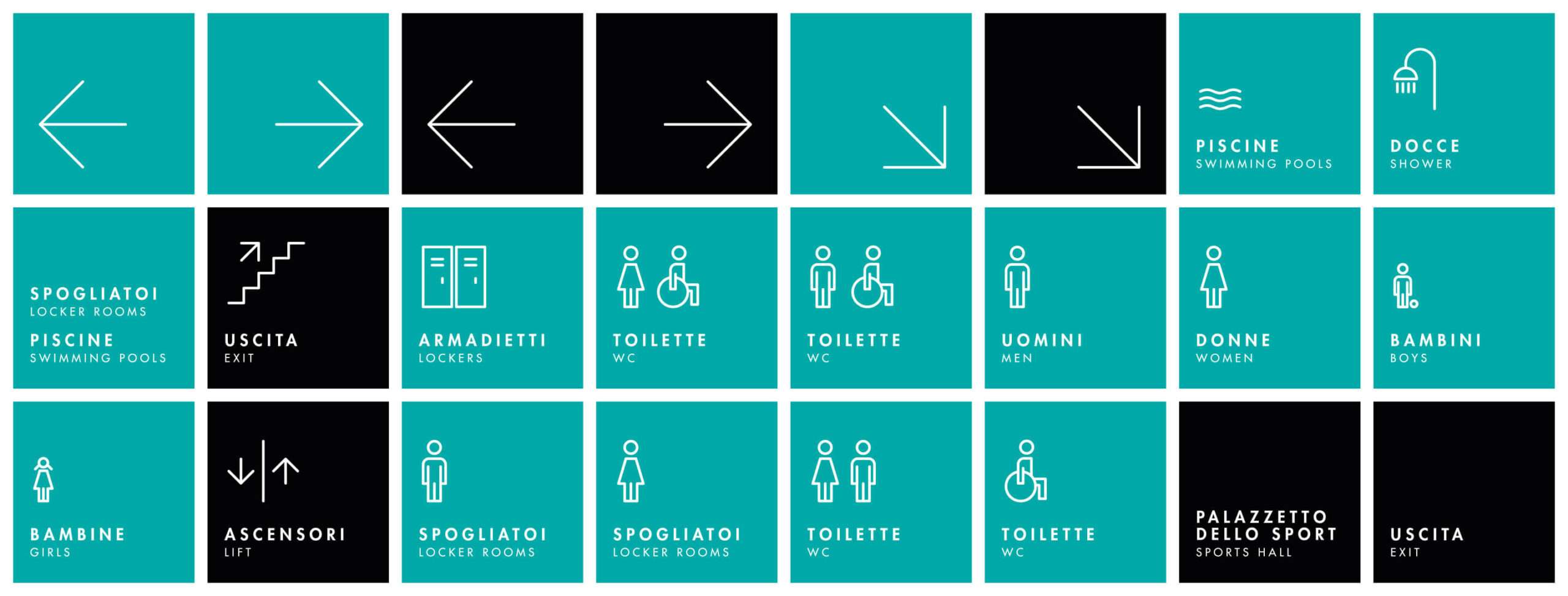
Wayfinding. Indoor signage.
Wayfinding is the set of techniques and systems that help people orient and move around a space, be it an urban environment, a building or a virtual space. In practice, wayfinding concerns the use of signs, maps, symbols, colours, and other visual or tactile tools to facilitate navigation within an area. The main purpose is to make spaces more understandable and accessible, reducing confusion and disorientation. This is especially important in complex locations such as sports facilities. For Aquamore, we designed and set up the interior signage.
Digital Signage. Displays for communication.
Digital signage is a form of visual communication that uses digital screens, such as monitors or projectors, to display multimedia content dynamically and updatable in real time. These screens can be placed in public spaces, shops, offices, airports, stations, hotels, and many other locations to broadcast information, advertising messages, updates, directions, or entertainment.
The advantages of Digital Signage over traditional signage include the ability to update content in real time, customise messages according to audience or time of day, and use images, videos and animations to create engaging and interactive content. With a trusted technology partner like Benq, we were responsible for designing the digital signage experience and installing the information and advertising monitors at some of Aquamore’s facilities.
![]()
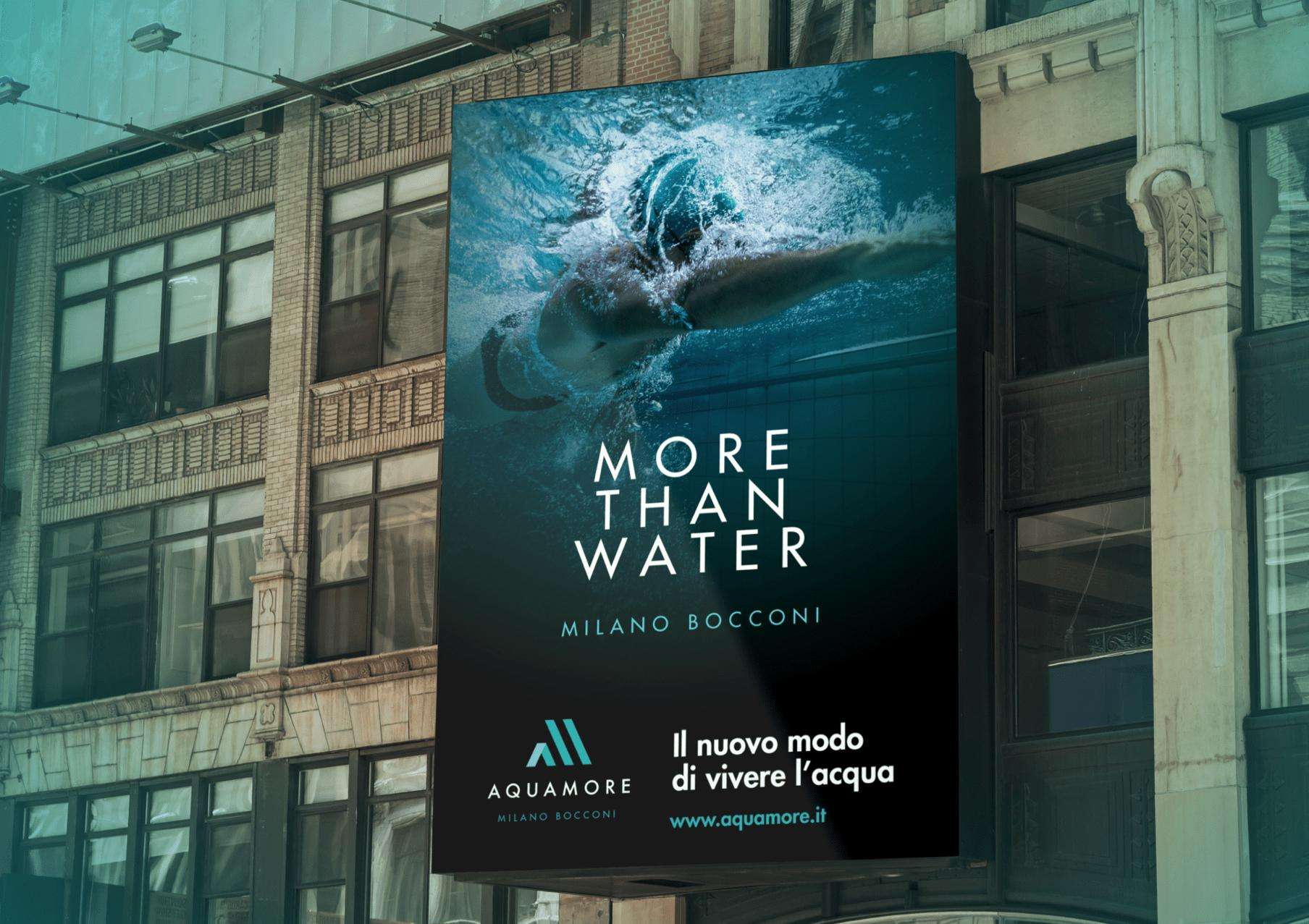
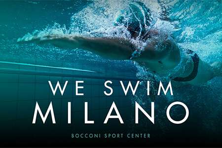
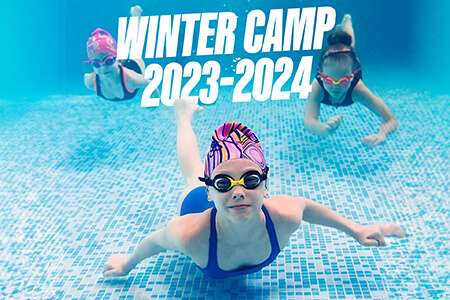
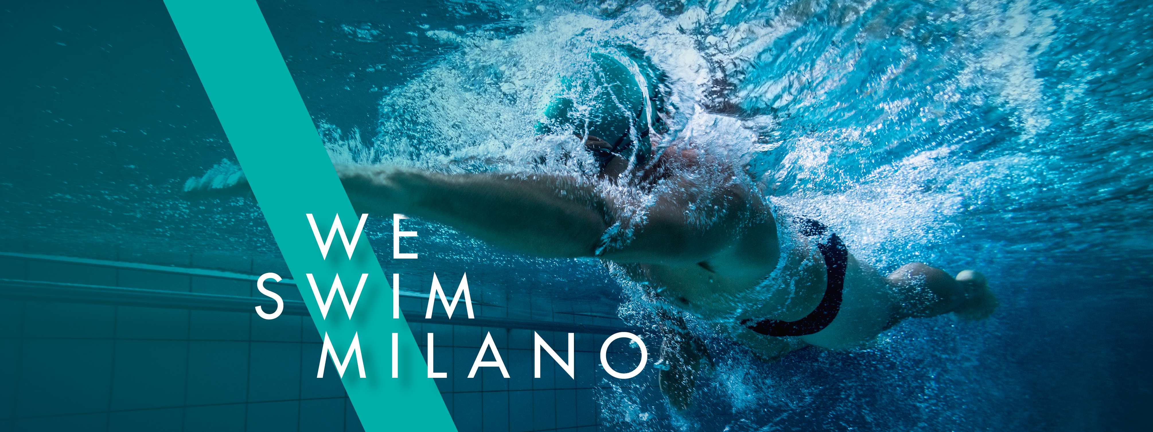
Communication campaigns.
In a self-respecting communication strategy, it is essential to have a guiding concept that sets the tone for all the communication actions to be undertaken. The concept will be the basis of the creative proposal, and will be translated into graphic elements, images and texts that summarise and concretise the message.
We have accompanied Aquamore in the strategy and online and offline positioning at the launch of the main installations, taking care of the conception of the communication concepet, the planning and adaptation of the materials for social, direct email marketing, billposting, etc. etc.